Brand book
Calm, simple and honest, in three short moments a day.
Version 1 · October 2026
Nothing here is a real company

00 Contents
Everything in one place.
- 01Who it is for
- 02What we stand for
- 03Brand structure
- 04Voice
- 05If aparté were a person
- 06What we refuse
- 07Lines we use
- 08Logo
- 09Colour
- 10Type
- 11Photography
- 12Packaging and labels
- 13The website
- 14The store
- 15Claims and honesty
- 16Before you publish
A dashed tag marks wording arranged from approved text. Tags come off once approved.
01 Who it is for
Busy working women, with no time to research.
Busy working women in the United States, aged 35 to 44, who have little time and no wish to research. They want a short, calm routine. They are tired of too many steps, heavy or sticky products, and big promises in tiny print.

What she runs into today
- Skin that feels tight or dry
- Skin that looks dull or tired
- Skin that gets shiny by the afternoon
- Too many steps
- A routine that is hard to keep going
- Products that feel heavy or sticky
02 What we stand for
Calm. Simple. Honest.
Short routines, quiet design, nothing shouting.
Three moments a day (Morning, Midday, Night), each a small pre-chosen set. The promise is fewer decisions, not a tiny shelf.
Plain words. We say how a product feels and what it is for, never more.
03 Brand structure
One parent, three moments.
Aparté is the parent brand. Products are organised into three moments. Pause, the midday serum, is the hero product brand and leads the campaign The Midday Reset. Each product brand has its own kit and always shows from aparté.
A calm start
Daybreak · coming soon
The Midday Reset
Wind down
Dusk · coming soon
04 Voice
Elevated and poised.
Calm, plain, a little wry. Short sentences. We talk to one person.
Do
A calm pause in the middle of your day.
Three short moments, chosen for you.
Plain words. No big promises.
Don’t
Miracle serum for flawless skin!
Detox your pores in 7 days.
Only 3 left, order in the next 10 minutes!
Words to avoid
05 If aparté were a person
Someone you would trust at noon.
She is
- Elevated
- Poised
- Calm
- Plain-spoken
- A little wry
She is not
- Shouting
- Promising miracles
- Rushing you
- Shaming anyone
06 What we refuse
Six things we will not do.
- 01Medical or miracle claims.
- 02Before-and-after promises.
- 03Fake urgency or countdown timers.
- 04Shaming people about their skin.
- 05Wasteful packaging.
- 06Using “clean” or “natural” as proof.
07 Lines we use
The promiseCalm, simple and honest, in three short moments a day.
The Pause hero lineOne minute for your skin, in the middle of the day.
The Pause lineA midday pause, in four small steps.
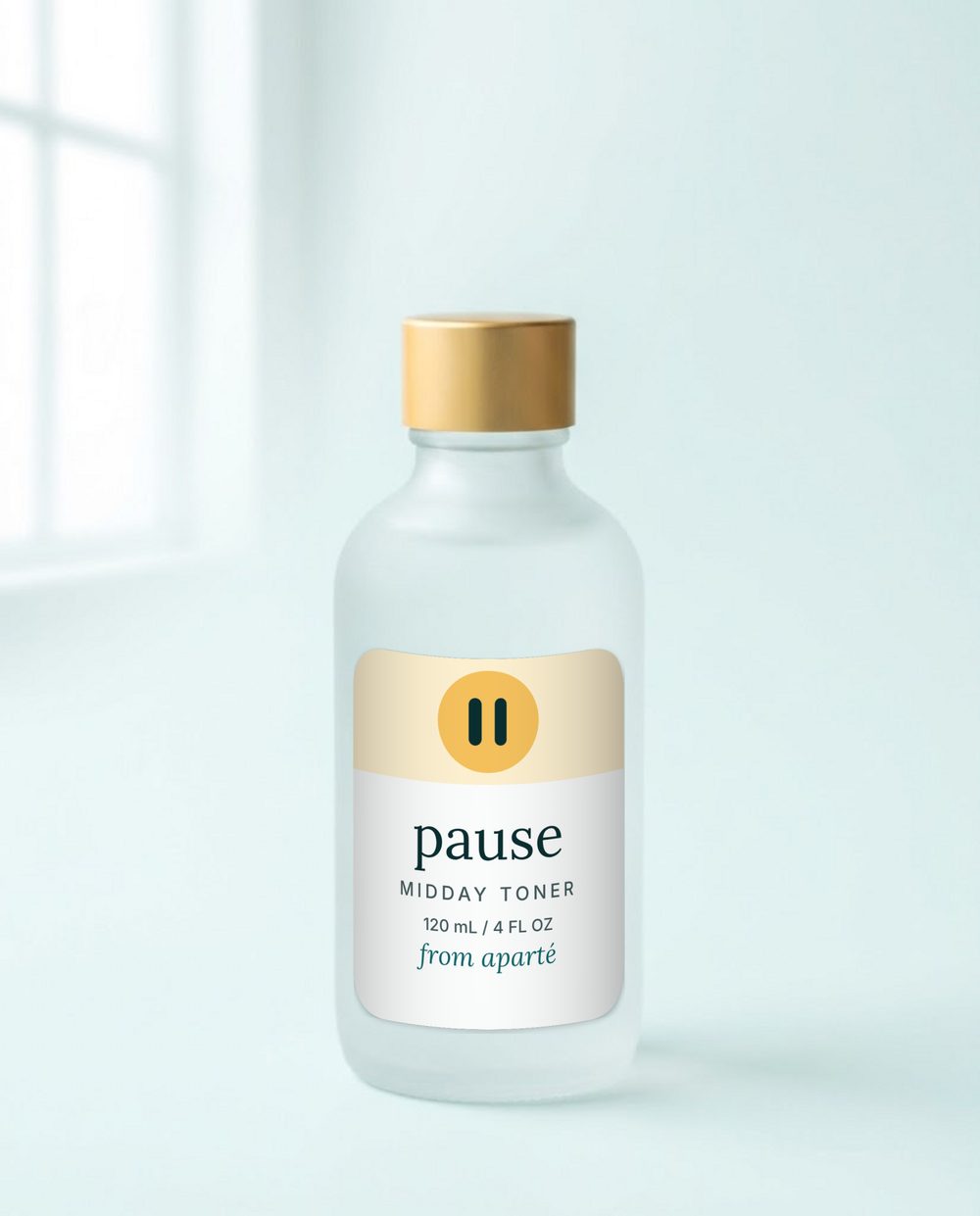
Pause Toner
A cool, quiet reset between meetings.
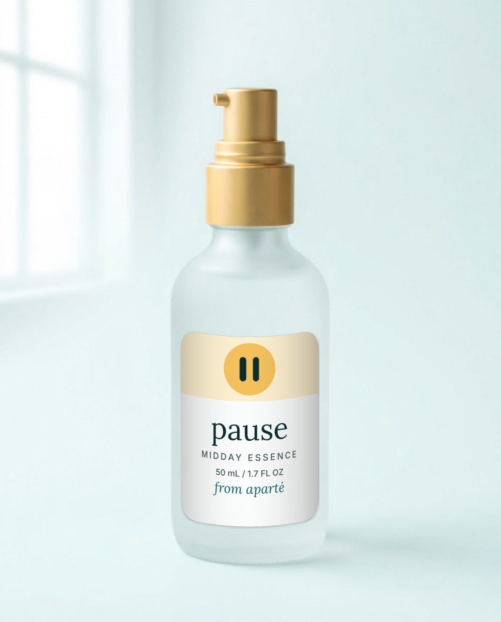
Pause Essence
A light layer for a long afternoon.
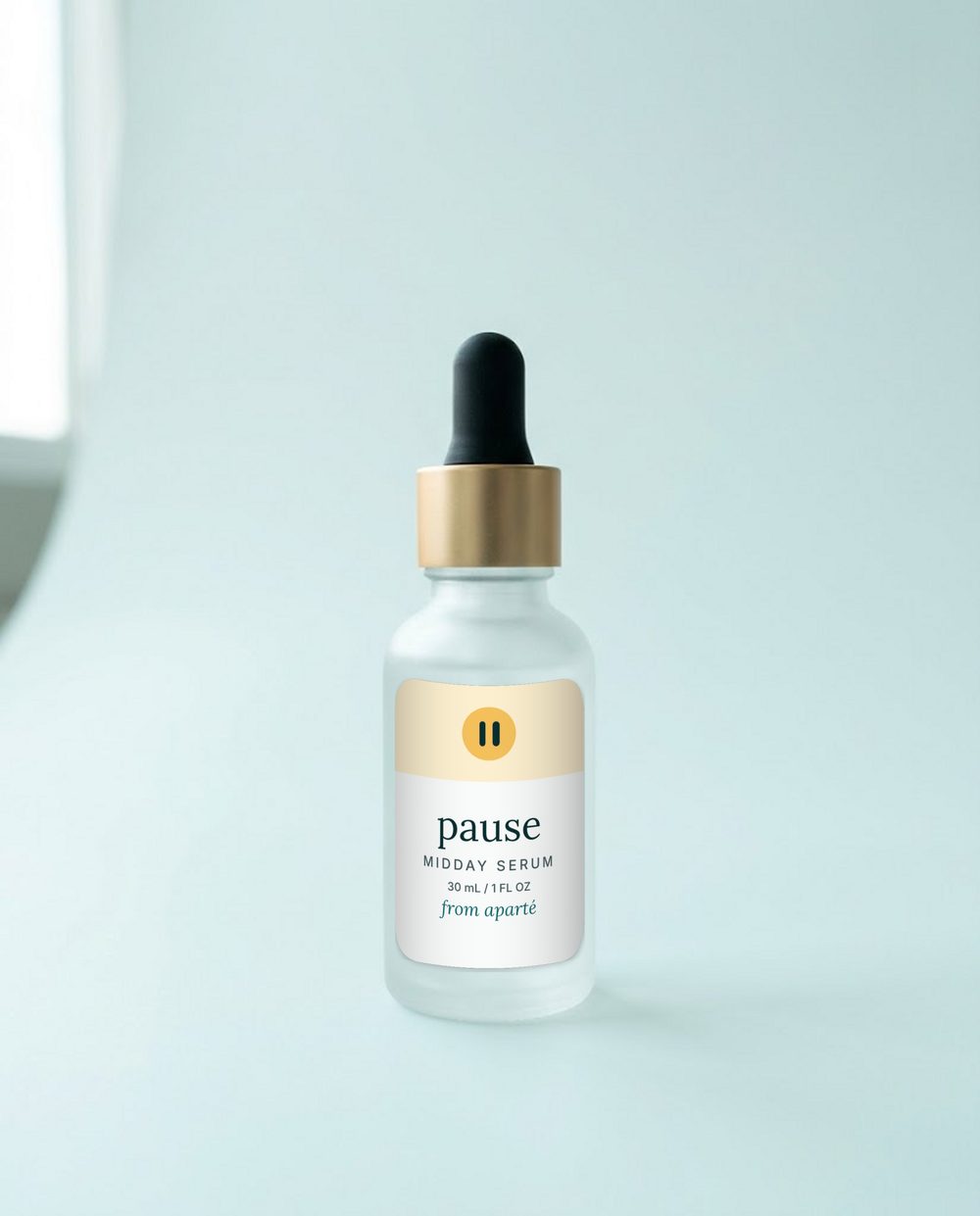
Pause
One minute for your skin, in the middle of the day.
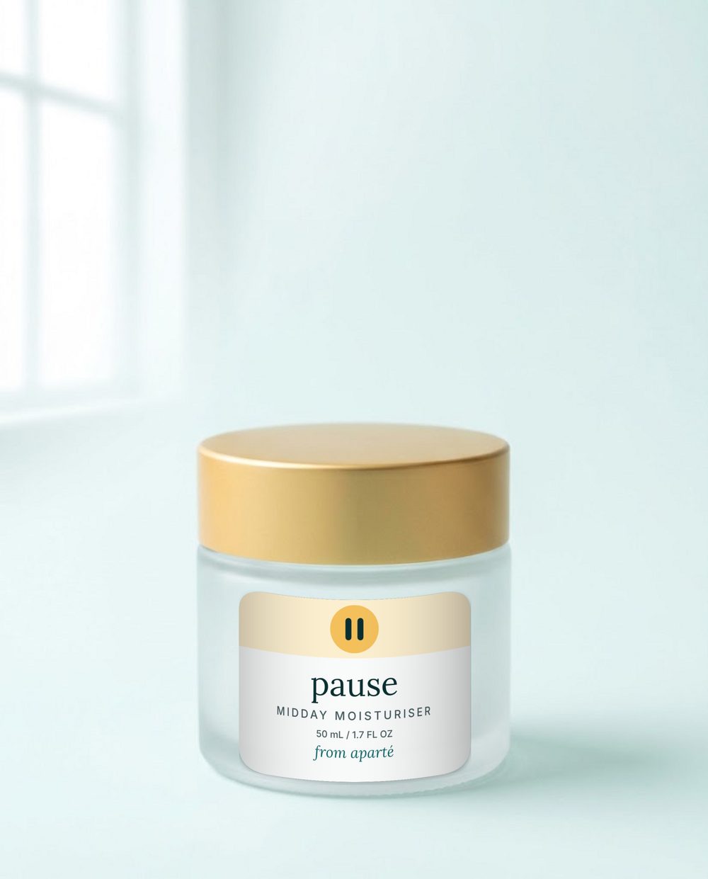
Pause Moisturiser
A soft close to the midday pause.
08 Logo
A lowercase wordmark with two small pause bars.
Use the light version on white and light tints, and the dark version on deep teal (#0b2f31). The logo is the same everywhere: the store, emails, social and packaging.
Clear space and size
Clear space: the height of the letter “a” on every side. Minimum width 96px. Below 48px, use the favicon version.
With a product brand
Always show from aparté with the Pause logo.
Don’t
Set it in capitals.
Recolour it.
Add effects or tilt it.
Place it on a busy background.
09 Colour
Deep teal, ink and a lot of white.
Deep teal is the brand colour, ink is text, white is the background. Aqua is decoration, and text only in dark mode.
#0E6468#0B2F31#6CC3C6#EEF6F6#FFFFFFThe three moments
#FFF3D9#E2F2F2#E4E9F5Pause only: the midday gold
#F4C15D#FDF0D0#7A4F00Do
Teal for buttons and key accents.
Lots of white space.
Ink text on tinted backgrounds.
Don’t
Aqua as text on white (fails contrast).
More than one accent in a layout.
Gold or tints on Aparté pages (that is Pause’s).
10 Type
Lora for headings. Inter for everything else.
In email, use Georgia and Arial.
Lora · headings, 400 to 700 · Inter · body, 400, 500 and 600
11 Photography
One look for the product. One woman for the day.
The product
- Frosted glass with a matte sun-gold collar, cap, pump or lid.
- A seamless pale aqua-white backdrop.
- Soft window daylight from the upper left, a gentle shadow to the lower right.
- Straight-on or slightly above, centred, 4:5 portrait, with calm space around it.
- No people, no flowers, no splashes, nothing that suggests a result.
The day
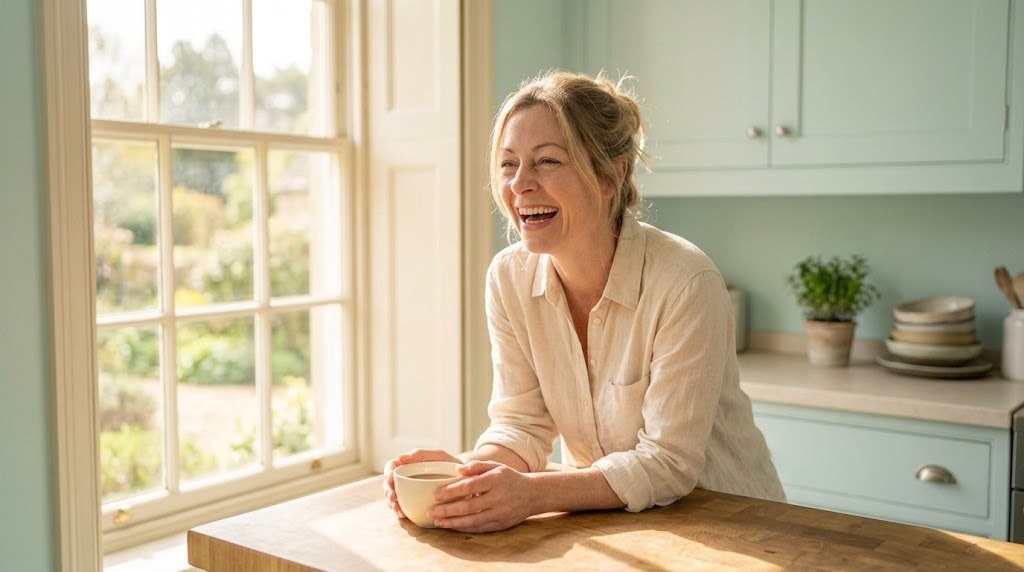
- One woman, shown in everyday moments across a day.
- Soft, warm sunlight. Pale aqua, cream and a little gold.
- She is the story. The product supports her.
- No before-and-after, and nothing that implies a result.
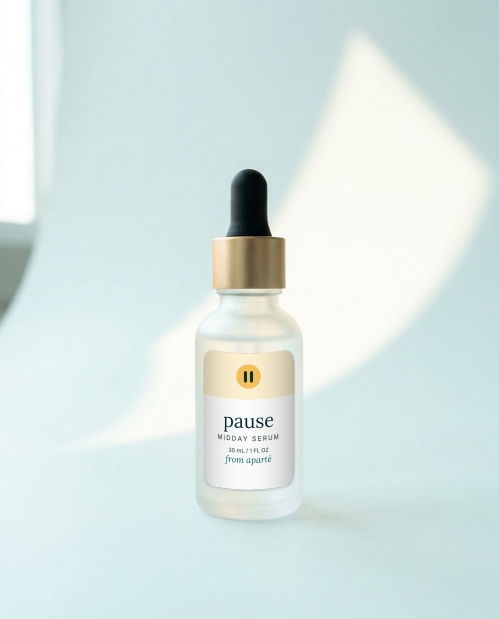
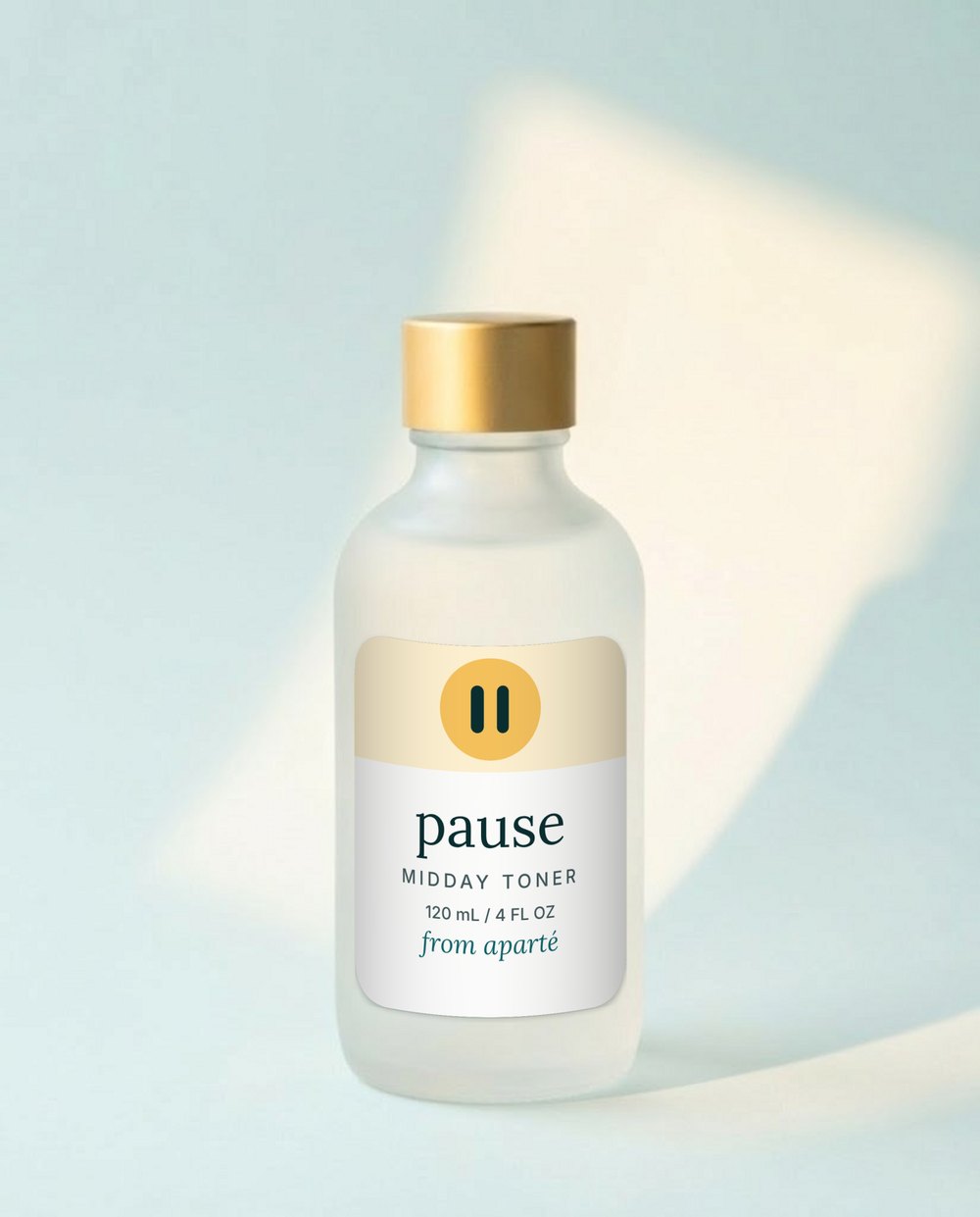
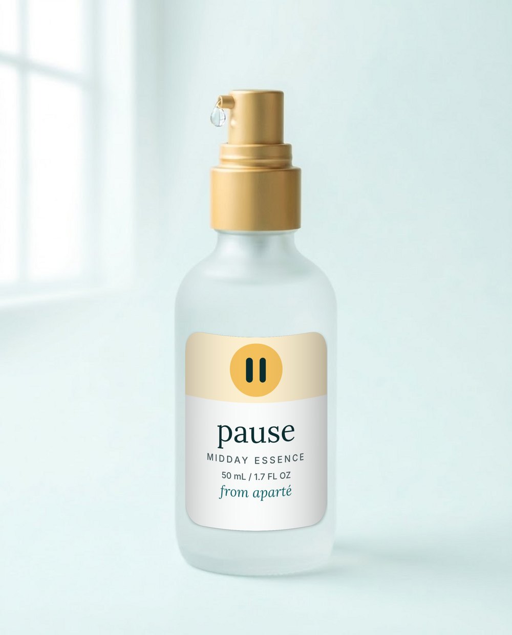
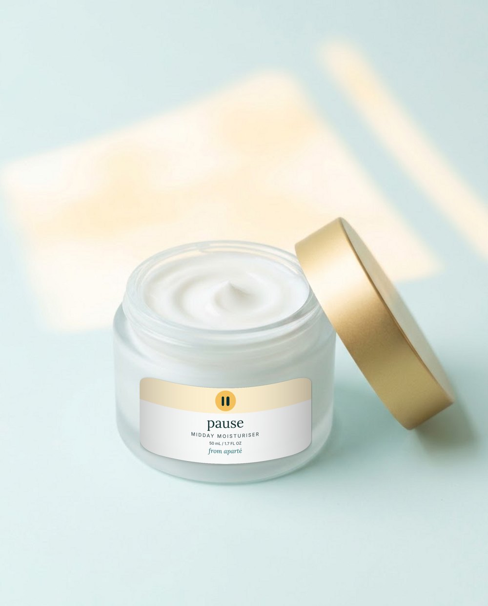


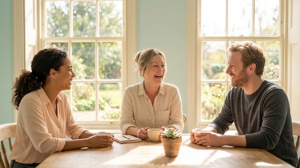
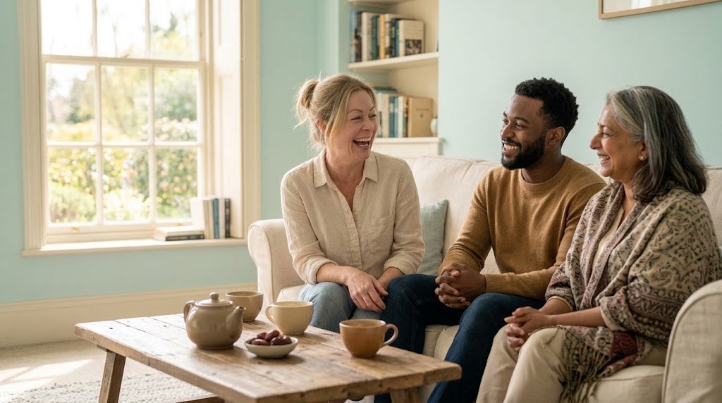
The images of the woman and the products are AI-generated placeholders. They are for reference, to guide the client and the photographer brief, and will be replaced by final photography. They are not real product or lifestyle photography.
12 Packaging and labels
Every label has the same layout.
Tinted top band with the mark, product name, descriptor, size, and for product brands the line from aparté.
Concept labels, not real products. Real labels need ingredient and regulatory text before any real sale.
13 The website
Pause first, with her at the centre.
One page, built on the same teal and type. It opens on Pause and the approved line, shows the four small steps, and keeps Daybreak and Dusk small and coming soon.
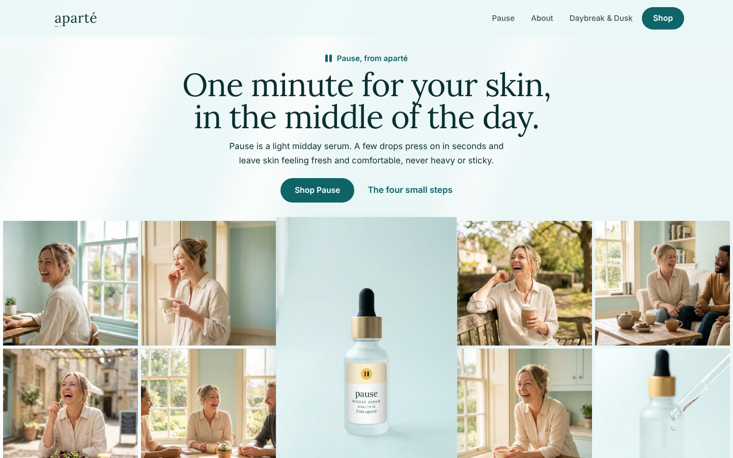
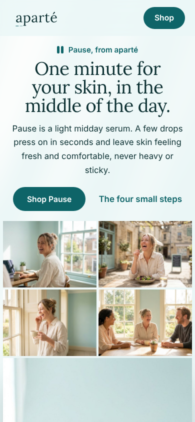
The approved line, and a collage of her day around the Pause serum.
Toner, essence, serum, moisturiser, shown as small labelled cards.
Each product in its own story, with the complete product beside her photo.
A concept site. Nothing on it is for sale, and it asks search engines not to index it.
14 The store
Four Pause products, one collection.
A Shopify development store. Each product carries its labelled photo, size and an invented concept price.
Pause
Midday serum · 1 fl oz (30 mL)
Pause Toner
4 fl oz (120 mL)
Pause Essence
1.7 fl oz (50 mL)
Pause Moisturiser
1.7 fl oz (50 mL)
Prices are invented. The store is password-protected and nothing in it is for sale.
15 Claims and honesty
How it feels, and what it is for. Never more.
We describe how a product feels and what it is for. We never treat, cure or promise results.
No numbers or results we cannot show. Every number carries a source.
Anything unbuilt or invented is labelled concept. Prices, reviews and shoppers in this case study are invented.
Left out on purpose and labelled as a gap. Sunscreen counts as a drug in the US, so it needs its own review.
16 Before you publish